sickn33/agentic-awesome-skills / plugins/aasb-aas-mobile-app-builder/skills/hig-components-layout
hig-components-layout
VerifiedApple Human Interface Guidelines for layout and navigation components.
| File | Kind | Size |
|---|---|---|
| SKILL.md | skill md | 7.5 KB |
| references/boxes.md | markdown | 3.0 KB |
| references/column-views.md | markdown | 3.2 KB |
| references/lists-and-tables.md | markdown | 11.1 KB |
| references/ornaments.md | markdown | 5.1 KB |
| references/outline-views.md | markdown | 6.1 KB |
| references/panels.md | markdown | 7.3 KB |
| references/scroll-views.md | markdown | 12.1 KB |
| references/sidebars.md | markdown | 11.0 KB |
| references/split-views.md | markdown | 10.5 KB |
| references/tab-bars.md | markdown | 15.9 KB |
| references/tab-views.md | markdown | 5.4 KB |
| references/windows.md | markdown | 22.2 KB |
references/boxes.md
View on GitHub---
title: "Boxes | Apple Developer Documentation"
source: https://developer.apple.com/design/human-interface-guidelines/boxes
---
# Boxes
A box creates a visually distinct group of logically related information and components.
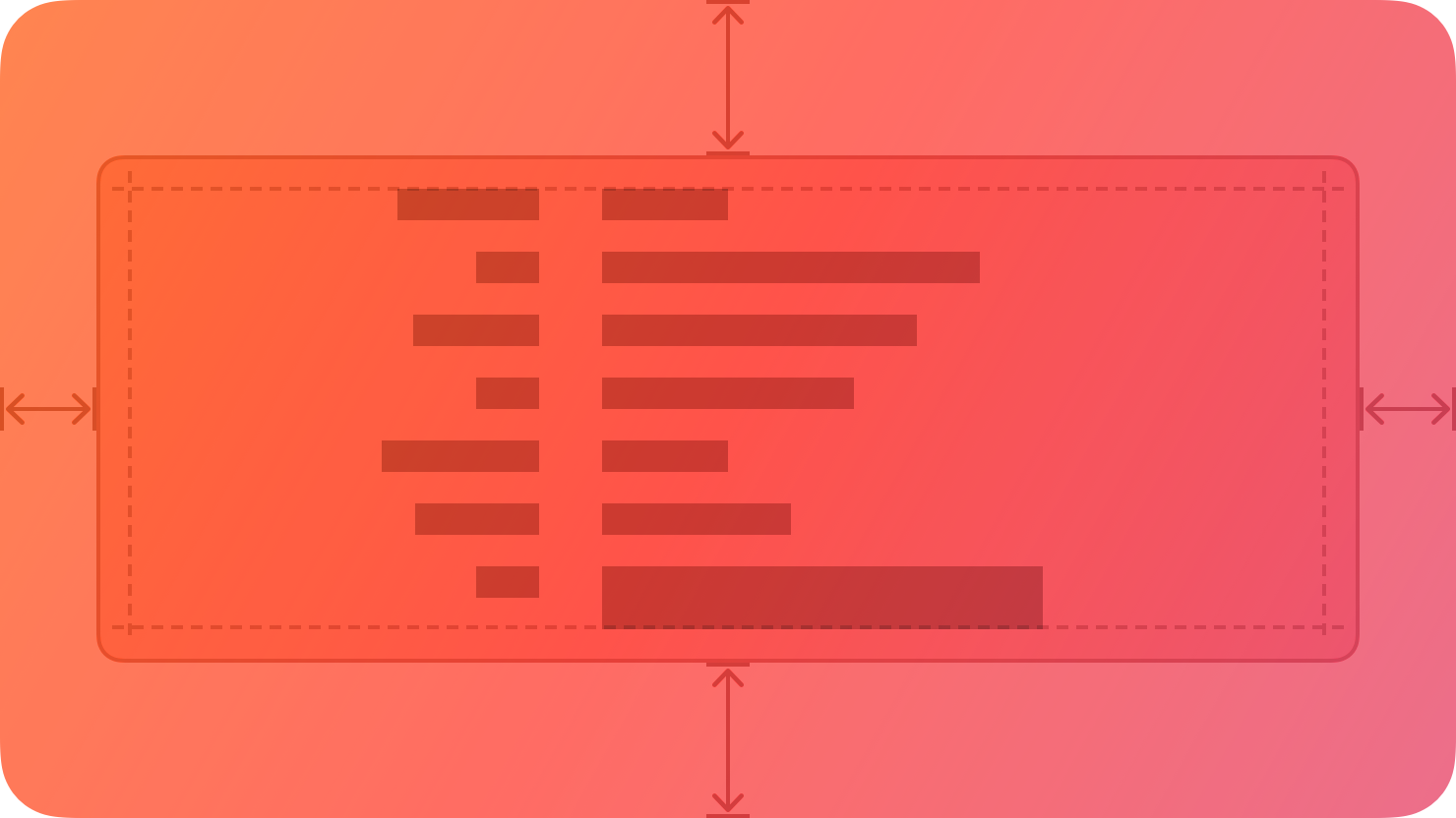
By default, a box uses a visible border or background color to separate its contents from the rest of the interface. A box can also include a title.
## [Best practices](https://developer.apple.com/design/human-interface-guidelines/boxes#Best-practices)
**Prefer keeping a box relatively small in comparison with its containing view.** As a box’s size gets close to the size of the containing window or screen, it becomes less effective at communicating the separation of grouped content, and it can crowd other content.
**Consider using padding and alignment to communicate additional grouping within a box.** A box’s border is a distinct visual element — adding nested boxes to define subgroups can make your interface feel busy and constrained.
## [Content](https://developer.apple.com/design/human-interface-guidelines/boxes#Content)
**Provide a succinct introductory title if it helps clarify the box’s contents.** The appearance of a box helps people understand that its contents are related, but it might make sense to provide more detail about the relationship. Also, a title can help VoiceOver users predict the content they encounter within the box.
**If you need a title, write a brief phrase that describes the contents.** Use sentence-style capitalization. Avoid ending punctuation unless you use a box in a settings pane, where you append a colon to the title.
## [Platform considerations](https://developer.apple.com/design/human-interface-guidelines/boxes#Platform-considerations)
_No additional considerations for visionOS. Not supported in tvOS or watchOS._
### [iOS, iPadOS](https://developer.apple.com/design/human-interface-guidelines/boxes#iOS-iPadOS)
By default, iOS and iPadOS use the secondary and tertiary background [colors](https://developer.apple.com/design/human-interface-guidelines/color) in boxes.
### [macOS](https://developer.apple.com/design/human-interface-guidelines/boxes#macOS)
By default, macOS displays a box’s title above it.
## [Resources](https://developer.apple.com/design/human-interface-guidelines/boxes#Resources)
#### [Related](https://developer.apple.com/design/human-interface-guidelines/boxes#Related)
[Layout](https://developer.apple.com/design/human-interface-guidelines/layout)
#### [Developer documentation](https://developer.apple.com/design/human-interface-guidelines/boxes#Developer-documentation)
[`GroupBox`](https://developer.apple.com/documentation/SwiftUI/GroupBox) — SwiftUI
[`NSBox`](https://developer.apple.com/documentation/AppKit/NSBox) — AppKit
Related skills
| Skill | Stars | Updated | Works with | Status | Install |
|---|---|---|---|---|---|
| brainstormingobra/superpowersYou MUST use this before any creative work - creating features, building components, adding functionality, modifying behavior, or planning anything new, in software or out of it (a talk, a business, a renovation). | Stars: 322k | Updated | Claude CodeCodex | Verified | Install |
| brand-guidelinesanthropics/skillsApplies Anthropic's official brand colors and typography to any sort of artifact that may benefit from having Anthropic's look-and-feel. Use it when brand colors or style guidelines, visual formatting, or company design standards apply. | Stars: 198k | Updated | Claude CodeCodex | Verified | Install |
| frontend-designanthropics/skillsGuidance for distinctive, intentional visual design when building new UI or reshaping an existing one. Helps with aesthetic direction, typography, and making choices that don't read as templated defaults. | Stars: 198k | Updated | Claude CodeCodex | Verified | Install |
| mcp-builderanthropics/skillsGuide for creating high-quality MCP (Model Context Protocol) servers that enable LLMs to interact with external services through well-designed tools. Use when building MCP servers to integrate external APIs or services, whether in Python (FastMCP) or Node/TypeScript (MCP SDK). | Stars: 198k | Updated | Claude CodeCodex | Verified | Install |