NeelakshSaxena/Drishti / .agents/skills/adaptive
adaptive
VerifiedInstructions to make or update an app's UI so that it adapts to different Android devices including phones, tablets, foldables, laptops, desktop, TV, Auto and XR. It includes how to handle different window sizes, pointing devices (such as mouse) and text entry devices (such as keyboard) using the Compose MediaQuery API. It also covers multi-pane layouts using Navigation3 Scenes, adaptive UI components (such as buttons) with varying target sizes, and adaptive layouts (including navigation areas - nav rails and nav bars) using the Compose Grid and FlexBox APIs.
references/android/develop/ui/compose/layouts/adaptive/flexbox/item-behavior.md
View on GitHubUse `Modifier.flex` to control how an item changes size, order, and is aligned
inside a `FlexBox`.
## Item size
Use the `basis`, `grow`, and `shrink` functions to control an item's size.
```kotlin
FlexBox {
RedRoundedBox(
modifier = Modifier.flex {
basis(FlexBasis.Auto)
grow(1.0f)
shrink(0.5f)
}
)
}
```
<br />
### Set initial size
Use `basis` to specify the item's initial size before any extra space is
distributed. You can think of this as the item's *preferred* size.
|---|---|---|---|
| **Value type** | **Behavior** | **Code snippet** Note: The boxes have a maximum intrinsic size of `100dp` | **Example using container width `600dp`** |
| `Auto` (default) | Use the item's maximum intrinsic size. For example, a `Text` composable's maximum intrinsic width is the width of all its text on a single line - no wrapping. | ```kotlin FlexBox { RedRoundedBox( Modifier.flex { basis(FlexBasis.Auto) } ) BlueRoundedBox( Modifier.flex { basis(FlexBasis.Auto) } ) } ``` |  |
| Fixed `dp` | A fixed size in Dp. | ```kotlin FlexBox { RedRoundedBox( Modifier.flex { basis(200.dp) } ) BlueRoundedBox( Modifier.flex { basis(100.dp) } ) } ``` |  |
| Percentage | A percentage of the container size. | ```kotlin FlexBox { RedRoundedBox( Modifier.flex { basis(0.7f) } ) BlueRoundedBox( Modifier.flex { basis(0.3f) } ) } ``` |  |
If the basis value is less than the item's intrinsic minimum size, the intrinsic
minimum size is used instead. For example, if a `Text` item that contains a word
requires `50dp` to display, but also has `basis = 10.dp`, a
value of `50dp` is used.
### Grow items when there's space
Use `grow` to specify how much an item grows when there is extra space. This is
space remaining in the `FlexBox` container after all the items' `basis` values
have been added up. The `grow` value indicates *how much* of the extra space a
given child will receive, relative to its siblings. By default, items won't
grow.
The following example shows a `FlexBox` with three child items. Each has a basis
value of `100dp`. The first child has a positive `grow` value. Since there is
only one child with a `grow` value, the actual value is irrelevant - as long as
it's positive, the child receives all the extra space.
The images show the `FlexBox` behavior when its container size is `600dp`.
|---|---|
| ```kotlin FlexBox { RedRoundedBox( title = "400dp", modifier = Modifier.flex { grow(1f) } ) BlueRoundedBox(title = "100dp") GreenRoundedBox(title = "100dp") } ``` | Each child has a basis value of `100dp`. There is `300dp` of extra space.  Child 1 grows by `300dp` to fill the extra space.  |
In the following example, the container size and `basis` size are the same. The
difference is that each child has a different `grow` value.
|---|---|
| ```kotlin FlexBox { RedRoundedBox( title = "150dp", modifier = Modifier.flex { grow(1f) } ) BlueRoundedBox( title = "200dp", modifier = Modifier.flex { grow(2f) } ) GreenRoundedBox( title = "250dp", modifier = Modifier.flex { grow(3f) } ) } ``` | Each child has a basis value of `100dp`. There is `300dp` of extra space.  The total grow value is 6. Child 1 grows by (1 / 6) \* 300 = `50dp` Child 2 grows by (2 / 6) \* 300 = `100dp` Child 3 grows by (3 / 6) \* 300 = `150dp`  |
### Shrink items when there's insufficient space
Use `shrink` to specify how much an item shrinks when the `FlexBox` container
has insufficient space for all the items. `shrink` works the same way as `grow`
except that, instead of distributing *extra space* to items, the *space deficit*
is distributed to items. The `shrink` value specifies how much of the space
deficit the item receives, or rather, how much the item will shrink by. By
default, items have a `shrink` value of `1f`, meaning they shrink equally.
The following example shows two `Text` composables with the same text. The first
child has a shrink value of `1f`, meaning it shrinks to absorb all the space
deficit.
```kotlin
FlexBox {
Text(
"The quick brown fox",
fontSize = 36.sp,
modifier = Modifier
.background(PastelRed)
.flex { shrink(1f) }
)
Text(
"The quick brown fox",
fontSize = 36.sp,
modifier = Modifier
.background(PastelBlue)
.flex { shrink(0f) }
)
}
```
<br />
As the container size shrinks, Child 1 shrinks.
|---|---|
| **Container size** | **FlexBox UI** |
| `700dp` |  |
| `500dp` |  |
| `450dp` | 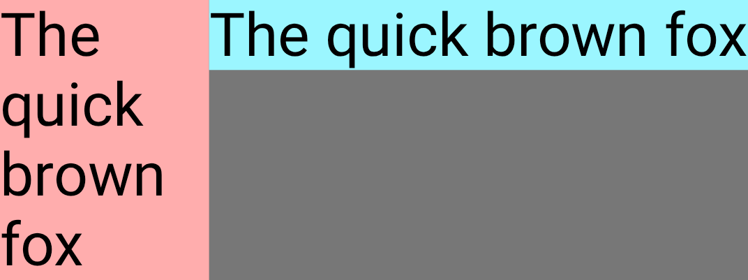 |
## Item alignment
Use `alignSelf` to control how an item is aligned to the cross axis. This
overrides the [`alignItems` property](https://developer.android.com/develop/ui/compose/layouts/adaptive/flexbox/container-behavior#align-distribute) of the container for this item. It
has all the same possible values, with the addition of `Auto` which inherits the
behavior of the `FlexBox` container.
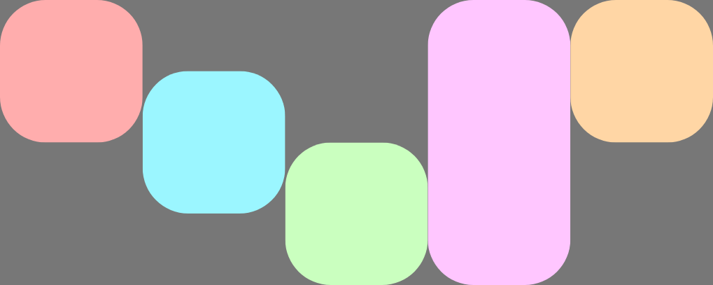
For example, this `FlexBox` has `alignItems` set to `Start` and five children
which override the cross axis alignment.
```kotlin
FlexBox(
config = {
alignItems(FlexAlignItems.Start)
}
) {
RedRoundedBox()
BlueRoundedBox(modifier = Modifier.flex { alignSelf(FlexAlignSelf.Center) })
GreenRoundedBox(modifier = Modifier.flex { alignSelf(FlexAlignSelf.End) })
PinkRoundedBox(modifier = Modifier.flex { alignSelf(FlexAlignSelf.Stretch) })
OrangeRoundedBox(modifier = Modifier.flex { alignSelf(FlexAlignSelf.Baseline) })
}
```
<br />
## Item order
By default, `FlexBox` lays out items in the order that they are declared in
code. Override this behavior using `order`.
The default value for `order` is zero, and `FlexBox` sorts items based on this
value in ascending order. Any items that have the same `order` value are
laid out in the same order they are declared in. Use negative and positive
`order` values to move items to the start or end of a layout without changing
where they are declared.
The following example shows two child items. The first has the default `order`
of zero, and the second has an order of `-1`. After sorting, Child 1 appears
after Child 2.
```kotlin
FlexBox {
// Declared first, but will be placed after visually
RedRoundedBox(
title = "World"
)
// Declared second, but will be placed first visually
BlueRoundedBox(
title = "Hello",
modifier = Modifier.flex {
order(-1)
}
)
}
```
<br />
Related skills
| Skill | Stars | Updated | Works with | Status | Install |
|---|---|---|---|---|---|
| brainstormingobra/superpowersYou MUST use this before any creative work - creating features, building components, adding functionality, modifying behavior, or planning anything new, in software or out of it (a talk, a business, a renovation). | Stars: 322k | Updated | Claude CodeCodex | Verified | Install |
| brand-guidelinesanthropics/skillsApplies Anthropic's official brand colors and typography to any sort of artifact that may benefit from having Anthropic's look-and-feel. Use it when brand colors or style guidelines, visual formatting, or company design standards apply. | Stars: 198k | Updated | Claude CodeCodex | Verified | Install |
| frontend-designanthropics/skillsGuidance for distinctive, intentional visual design when building new UI or reshaping an existing one. Helps with aesthetic direction, typography, and making choices that don't read as templated defaults. | Stars: 198k | Updated | Claude CodeCodex | Verified | Install |
| mcp-builderanthropics/skillsGuide for creating high-quality MCP (Model Context Protocol) servers that enable LLMs to interact with external services through well-designed tools. Use when building MCP servers to integrate external APIs or services, whether in Python (FastMCP) or Node/TypeScript (MCP SDK). | Stars: 198k | Updated | Claude CodeCodex | Verified | Install |