inehemiasm/AiAssistant / skills/display-glasses-with-jetpack-compose-glimmer
display-glasses-with-jetpack-compose-glimmer
VerifiedProvides guidelines for developing projected Android XR apps for display glasses using the Jetpack Compose Glimmer UI toolkit. This skill covers foundational Glimmer design principles, workflows for implementing Jetpack Compose Glimmer, and interaction models for the glasses form factor. Use this skill to build an Android XR Augmented Experience app with Jetpack Compose Glimmer that adheres to the Glimmer design system for optimized glasses styling.
references/android/develop/xr/jetpack-xr-sdk/jetpack-compose-glimmer/title-chips.md
View on GitHub<br />
Applicable XR devices This guidance helps you build experiences for these types of XR devices. [Learn about XR device types →](https://developer.android.com/develop/xr/devices)  Display Glasses [](https://developer.android.com/develop/xr/devices#audio-display) [Learn about XR device types →](https://developer.android.com/develop/xr/devices)
<br />
In Jetpack Compose Glimmer, the [`TitleChip`](https://developer.android.com/reference/kotlin/androidx/xr/glimmer/TitleChip.composable) component is a non-interactive
component that provides brief context or labeling for associated content, such
as a [`Card`](https://developer.android.com/reference/kotlin/androidx/xr/glimmer/Card.composable) or a [`VerticalList`](https://developer.android.com/reference/kotlin/androidx/xr/glimmer/list/VerticalList.composable).
Use title chips for concise information like a short title, a category name, or
a status indicator. Normally, you should place title chips above the content
they describe to establish a clear structural relationship.
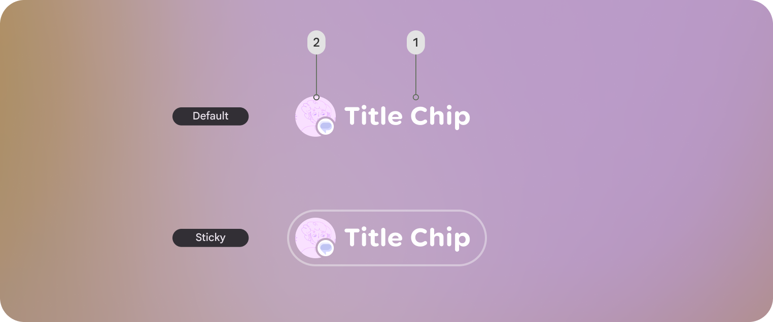 **Figure 1.** An example of a default style title chip and sticky title chip in Jetpack Compose Glimmer. Each title chip has a label (1) and an optional leading icon or entity (2).
## Basic example: Create a short title chip
The following code creates a basic title chip:
```kotlin
@Composable
fun TitleChipSample() {
TitleChip { Text("Messages") }
}
```
<br />
## Example: Create a title chip with a card
To use a title chip with another component, place the title chip
[`TitleChipDefaults.associatedContentSpacing`](https://developer.android.com/reference/kotlin/androidx/xr/glimmer/TitleChipDefaults#associatedContentSpacing()) above the other component in
the composable. The following code creates a title chip with a card:
```kotlin
@Composable
fun TitleChipWithCardSample() {
Column(horizontalAlignment = Alignment.CenterHorizontally) {
TitleChip { Text("Title Chip") }
Spacer(Modifier.height(TitleChipDefaults.associatedContentSpacing))
Card(
title = { Text("Title") },
subtitle = { Text("Subtitle") },
leadingIcon = { Icon(FavoriteIcon, "Localized description") },
) {
Text("Card Content")
}
}
}
```
<br />
### Key points about the code
- The title chip is centered horizontally, which is the usual alignment for a title chip placed above a card.
- The [`Spacer`](https://developer.android.com/reference/kotlin/androidx/compose/foundation/layout/Spacer.composable#Spacer(androidx.compose.ui.Modifier)) has a fixed height to provide the right amount of vertical spacing between the two components. This is defined using [`TitleChipDefaults.associatedContentSpacing`](https://developer.android.com/reference/kotlin/androidx/xr/glimmer/TitleChipDefaults#associatedContentSpacing()).
- Uses an optional `leadingIcon` to add additional visual context before the text content.
- The title chip automatically uses the [`caption`](https://developer.android.com/reference/kotlin/androidx/xr/glimmer/Typography#caption()) style for its text.
- The title chip isn't interactive. If you need a clickable label, use a [`Button`](https://developer.android.com/reference/kotlin/androidx/xr/glimmer/Button.composable) or another interactive component.Related skills
| Skill | Stars | Updated | Works with | Status | Install |
|---|---|---|---|---|---|
| brainstormingobra/superpowersYou MUST use this before any creative work - creating features, building components, adding functionality, modifying behavior, or planning anything new, in software or out of it (a talk, a business, a renovation). | Stars: 322k | Updated | Claude CodeCodex | Verified | Install |
| brand-guidelinesanthropics/skillsApplies Anthropic's official brand colors and typography to any sort of artifact that may benefit from having Anthropic's look-and-feel. Use it when brand colors or style guidelines, visual formatting, or company design standards apply. | Stars: 198k | Updated | Claude CodeCodex | Verified | Install |
| frontend-designanthropics/skillsGuidance for distinctive, intentional visual design when building new UI or reshaping an existing one. Helps with aesthetic direction, typography, and making choices that don't read as templated defaults. | Stars: 198k | Updated | Claude CodeCodex | Verified | Install |
| mcp-builderanthropics/skillsGuide for creating high-quality MCP (Model Context Protocol) servers that enable LLMs to interact with external services through well-designed tools. Use when building MCP servers to integrate external APIs or services, whether in Python (FastMCP) or Node/TypeScript (MCP SDK). | Stars: 198k | Updated | Claude CodeCodex | Verified | Install |