inehemiasm/AiAssistant / skills/display-glasses-with-jetpack-compose-glimmer
display-glasses-with-jetpack-compose-glimmer
VerifiedProvides guidelines for developing projected Android XR apps for display glasses using the Jetpack Compose Glimmer UI toolkit. This skill covers foundational Glimmer design principles, workflows for implementing Jetpack Compose Glimmer, and interaction models for the glasses form factor. Use this skill to build an Android XR Augmented Experience app with Jetpack Compose Glimmer that adheres to the Glimmer design system for optimized glasses styling.
references/android/develop/xr/jetpack-xr-sdk/jetpack-compose-glimmer/cards.md
View on GitHub<br />
Applicable XR devices This guidance helps you build experiences for these types of XR devices. [Learn about XR device types →](https://developer.android.com/develop/xr/devices)  Display Glasses [](https://developer.android.com/develop/xr/devices#audio-display) [Learn about XR device types →](https://developer.android.com/develop/xr/devices)
<br />
In Jetpack Compose Glimmer, the [`Card`](https://developer.android.com/reference/kotlin/androidx/xr/glimmer/Card.composable) component serves as the primary
container for related content, creating a clear visual boundary for digestible
units of information. Cards are highly adaptable, supporting combinations of
main content, optional titles, subtitles, and leading or trailing icons. Cards
fill the maximum available width by default, are focusable, and you can also
make them clickable. Cards support a vertical arrangement where the header image
is top-most, followed by the title, subtitle, and body content.
Cards are built on the Jetpack Compose Glimmer [surface system](https://developer.android.com/develop/xr/jetpack-xr-sdk/jetpack-compose-glimmer/surface), so they
inherit physical properties like depth effects, clipping, and consistent border
highlights.
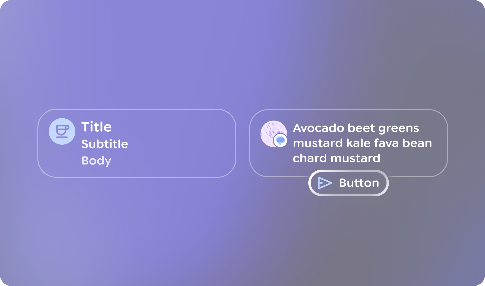 **Figure 1.** An example of some different styles of cards in Jetpack Compose Glimmer.
## Anatomy and slots
A Jetpack Compose Glimmer Card is built from several specialized elements that
let you customize its content and layout.
| Slot | Description |
|---|---|
| Header | The top section of the card, designed to hold an image. |
| Title and subtitle | These text fields provide the main and secondary labels for the card. The title is placed above the subtitle. |
| Leading icon | An optional icon (typically an [`Icon`](https://developer.android.com/reference/kotlin/androidx/xr/glimmer/Icon.composable)) that appears at the beginning of the card's content area. |
| Trailing icon | An optional icon that appears at the end of the card's content area. |
| Action | A slot for a primary interactive element, such as a [`Button`](https://developer.android.com/reference/kotlin/androidx/xr/glimmer/Button.composable). |
| Main content | The core body of the card for primary [`Text`](https://developer.android.com/reference/kotlin/androidx/xr/glimmer/Text.composable) or content. |
## Card defaults
The following defaults apply to cards:
- **Width**: Cards fill the maximum available width of the display to optimize legibility on display glasses.
- **Minimum height** : `80.dp`
- **Text vertical spacing** : `3.dp`
- **Header shape** : Uses [`RoundedCornerShape`](https://developer.android.com/reference/kotlin/androidx/compose/foundation/shape/package-summary#RoundedCornerShape(androidx.compose.ui.unit.Dp)) with `24.dp` corners
- **Content padding** : Defaults to [`GlimmerTheme.componentSpacingValues.medium`](https://developer.android.com/reference/kotlin/androidx/xr/glimmer/ComponentSpacingValues#medium()). This affects the outermost padding around header images and the content container.
- **Shape** : Defaults to [`GlimmerTheme.shapes.medium`](https://developer.android.com/reference/kotlin/androidx/xr/glimmer/Shapes#medium()).
- **Text rendering** : Uses the default values from
[`GlimmerTheme.typography`](https://developer.android.com/reference/kotlin/androidx/xr/glimmer/GlimmerTheme#typography()) for the following slots:
- Title: [`bodyMedium`](https://developer.android.com/reference/kotlin/androidx/xr/glimmer/Typography#bodyMedium())
- Subtitle: [`caption`](https://developer.android.com/reference/kotlin/androidx/xr/glimmer/Typography#caption())
- Main content: [`bodySmall`](https://developer.android.com/reference/kotlin/androidx/xr/glimmer/Typography#bodySmall())
## Example: Basic card
The following code creates a basic card:
```kotlin
@Composable
fun CardSample() {
Card { Text("This is a card") }
}
```
<br />
## Example: Complex card with multiple slots
The following code shows how to use multiple slots together to build a card.
```kotlin
@Composable
fun CardWithTitleAndLeadingIconAndHeaderAndAction() {
Card(
action = {
Button(onClick = {}, trailingIcon = { Icon(FavoriteIcon, "Localized description") }) {
Text("Send")
}
},
title = { Text("Title") },
leadingIcon = { Icon(FavoriteIcon, "Localized description") },
header = {
Image(MyHeaderImage, "Localized description", contentScale = ContentScale.FillWidth)
},
) {
Text("This is a card with a title, leading icon, header image, and action")
}
}
```
<br />
### Key points about the code
- Shows how to utilize various card elements, such as [`header`](https://developer.android.com/reference/kotlin/androidx/xr/glimmer/Card.composable), [`title`](https://developer.android.com/reference/kotlin/androidx/xr/glimmer/Card.composable), [`leadingIcon`](https://developer.android.com/reference/kotlin/androidx/xr/glimmer/Card.composable), and [`action`](https://developer.android.com/reference/kotlin/androidx/xr/glimmer/Card.composable), to customize the card's content and structure.
- Uses the standard [`Card`](https://developer.android.com/reference/kotlin/androidx/xr/glimmer/Card.composable#Card(kotlin.Function0,androidx.compose.ui.Modifier,kotlin.Function0,kotlin.Function0,kotlin.Function0,kotlin.Function0,kotlin.Function0,androidx.compose.ui.graphics.Shape,androidx.compose.ui.graphics.Color,androidx.compose.ui.graphics.Color,androidx.compose.foundation.BorderStroke,androidx.compose.foundation.layout.PaddingValues,kotlin.Function0)) overload with an action because only the card (or its internal action) needs to be focusable. If you need to make the entire card surface interactive, use the [`Card`](https://developer.android.com/reference/kotlin/androidx/xr/glimmer/Card.composable#Card(kotlin.Function0,androidx.compose.ui.Modifier,kotlin.Function0,kotlin.Function0,kotlin.Function0,kotlin.Function0,kotlin.Function0,androidx.compose.ui.graphics.Shape,androidx.compose.ui.graphics.Color,androidx.compose.ui.graphics.Color,androidx.compose.foundation.BorderStroke,androidx.compose.foundation.layout.PaddingValues,androidx.compose.foundation.interaction.MutableInteractionSource,kotlin.Function0)) overload with `onClick` instead.
- This card uses an action slot, so the card surface isn't focusable, and focus is directed to the action button instead.Related skills
| Skill | Stars | Updated | Works with | Status | Install |
|---|---|---|---|---|---|
| brainstormingobra/superpowersYou MUST use this before any creative work - creating features, building components, adding functionality, modifying behavior, or planning anything new, in software or out of it (a talk, a business, a renovation). | Stars: 322k | Updated | Claude CodeCodex | Verified | Install |
| brand-guidelinesanthropics/skillsApplies Anthropic's official brand colors and typography to any sort of artifact that may benefit from having Anthropic's look-and-feel. Use it when brand colors or style guidelines, visual formatting, or company design standards apply. | Stars: 198k | Updated | Claude CodeCodex | Verified | Install |
| frontend-designanthropics/skillsGuidance for distinctive, intentional visual design when building new UI or reshaping an existing one. Helps with aesthetic direction, typography, and making choices that don't read as templated defaults. | Stars: 198k | Updated | Claude CodeCodex | Verified | Install |
| mcp-builderanthropics/skillsGuide for creating high-quality MCP (Model Context Protocol) servers that enable LLMs to interact with external services through well-designed tools. Use when building MCP servers to integrate external APIs or services, whether in Python (FastMCP) or Node/TypeScript (MCP SDK). | Stars: 198k | Updated | Claude CodeCodex | Verified | Install |