inehemiasm/AiAssistant / skills/display-glasses-with-jetpack-compose-glimmer
display-glasses-with-jetpack-compose-glimmer
VerifiedProvides guidelines for developing projected Android XR apps for display glasses using the Jetpack Compose Glimmer UI toolkit. This skill covers foundational Glimmer design principles, workflows for implementing Jetpack Compose Glimmer, and interaction models for the glasses form factor. Use this skill to build an Android XR Augmented Experience app with Jetpack Compose Glimmer that adheres to the Glimmer design system for optimized glasses styling.
references/android/develop/xr/jetpack-xr-sdk/jetpack-compose-glimmer/buttons.md
View on GitHub<br />
Applicable XR devices This guidance helps you build experiences for these types of XR devices. [Learn about XR device types →](https://developer.android.com/develop/xr/devices)  Display Glasses [](https://developer.android.com/develop/xr/devices#audio-display) [Learn about XR device types →](https://developer.android.com/develop/xr/devices)
<br />
In Jetpack Compose Glimmer, a [`Button`](https://developer.android.com/reference/kotlin/androidx/xr/glimmer/Button.composable) is an interactive component that's
optimized for display glasses input, offering clear visual feedback through its
states to guide user actions.
Buttons are built on the Jetpack Compose Glimmer [surface system](https://developer.android.com/develop/xr/jetpack-xr-sdk/jetpack-compose-glimmer/surface), which
automatically handles physical properties like borders and depth.
The standard button contains a text label and optional icons. You can use it for
primary or secondary actions. There are also specialized buttons, such as [icon
buttons](https://developer.android.com/develop/xr/jetpack-xr-sdk/jetpack-compose-glimmer/icon-buttons) and [toggle buttons](https://developer.android.com/develop/xr/jetpack-xr-sdk/jetpack-compose-glimmer/toggle-buttons), which are defined as separate components in
Jetpack Compose Glimmer.
### Default
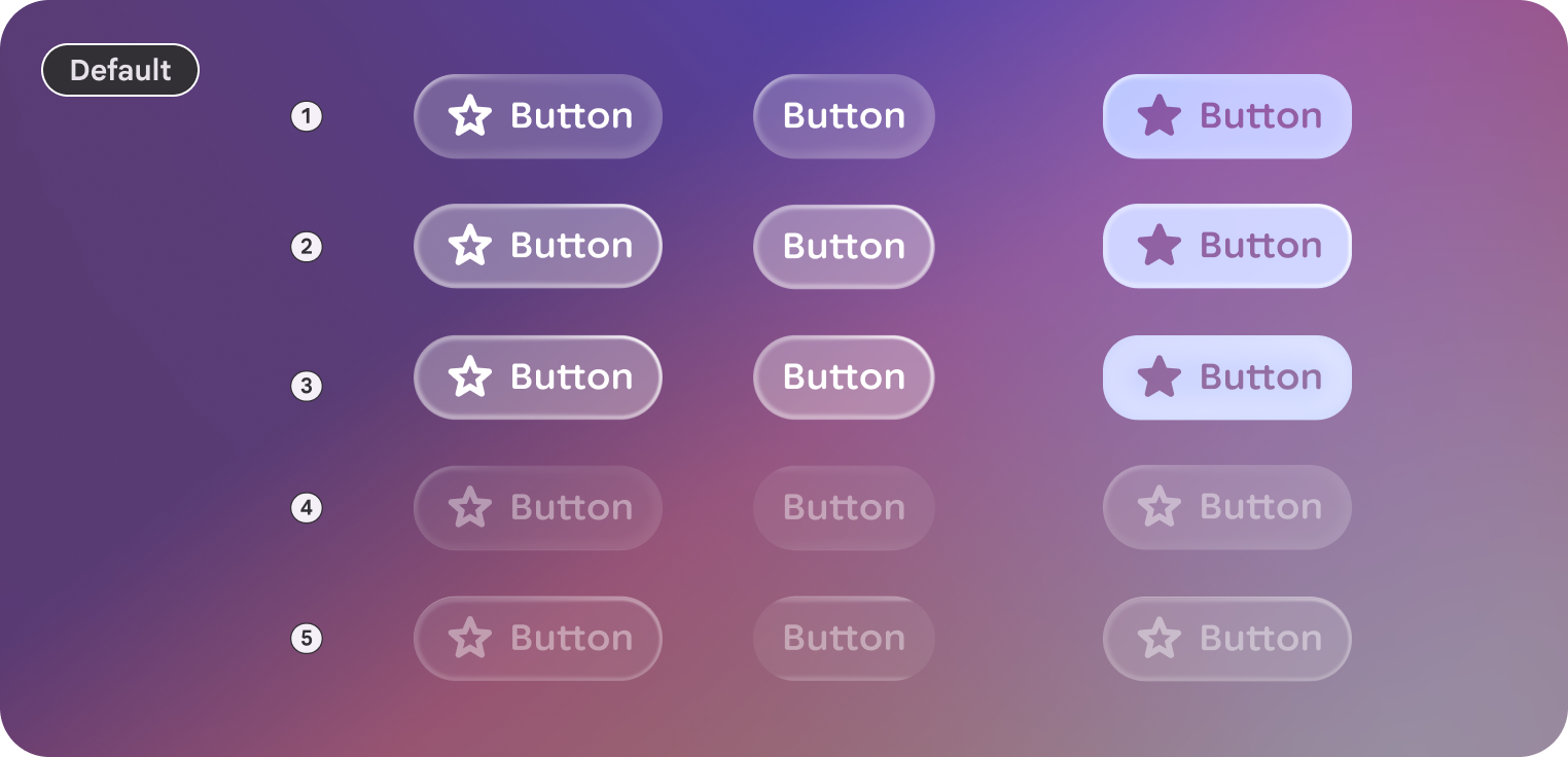 An example of some different styles of buttons in Jetpack Compose Glimmer. These examples show default, medium-sized buttons with three button states: Enabled (1), Focused (2), and Pressed (3).
### Large
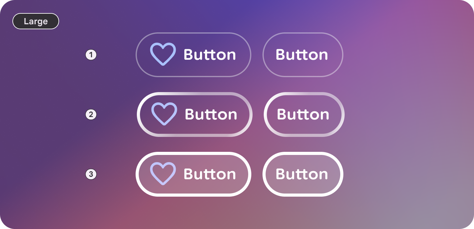 An example of some different styles of buttons in Jetpack Compose Glimmer. These examples show large-sized buttons with three button states: Enabled (1), Focused (2), and Pressed (3).
## Anatomy
A button consists of a container and a label, with optional leading and trailing
icons.
| Part | Description |
|---|---|
| Container | The background surface of the button. |
| Label | The text describing the action. |
| Icon (optional) | Leading or trailing visual indicators. |
## Sizes
Jetpack Compose Glimmer buttons support two size variants. These affect the
minimum height and internal padding.
| Size | Minimum height | Default usage |
|---|---|---|
| Medium | 48.dp | Standard actions and lists (default). |
| Large | 72.dp | High-emphasis actions or primary screen entry points. |
## States
Buttons in Jetpack Compose Glimmer change their appearance to communicate their
state.
- **Enabled**: The default state for an interactive button.
- **Focused** : When focused, the button applies a [`GlimmerTheme.depthEffectLevels.level1`](https://developer.android.com/reference/kotlin/androidx/xr/glimmer/DepthEffectLevels#level1()) and a focused border highlight.
- **Pressed**: When activated, a semi-transparent white overlay is applied to the surface.
- **Disabled**: The button doesn't respond to input and its visual appearance is adjusted.
## Button defaults
The following defaults apply to standard buttons:
- By default, buttons use [`GlimmerTheme.typography.bodySmall`](https://developer.android.com/reference/kotlin/androidx/xr/glimmer/Typography#bodySmall()). Make sure that text within buttons is concise and clearly describes the action.
- The default shape for a button is [`GlimmerTheme.shapes.large`](https://developer.android.com/reference/kotlin/androidx/xr/glimmer/Shapes#large()). This consistent rounding helps users identify buttons across the display glasses interface.
> [!NOTE]
> **Note:** Any modifier passed to the `Button` composable is applied to the outer layout. While [`ButtonSize`](https://developer.android.com/reference/kotlin/androidx/xr/glimmer/ButtonSize) sets the default minimum height, you can also apply custom size modifiers to control the button's final layout, such as [`Modifier.fillMaxWidth`](https://developer.android.com/reference/kotlin/androidx/compose/foundation/layout/fillMaxWidth.modifier).
## Example: Button with text
The following code creates a standard button with text:
```kotlin
@Composable
fun ButtonSample() {
Button(onClick = {}) { Text("Send") }
}
```
<br />
## Example: Buttons with leading and trailing icons
You can also add icons to the start (using `leadingIcon`) or end (using
`trailingIcon`) of the text to provide additional context.
The following code creates a button with a leading icon:
```kotlin
@Composable
fun ButtonWithLeadingIconSample() {
Button(onClick = {}, leadingIcon = { Icon(FavoriteIcon, "Localized description") }) {
Text("Send")
}
}
```
<br />Related skills
| Skill | Stars | Updated | Works with | Status | Install |
|---|---|---|---|---|---|
| brainstormingobra/superpowersYou MUST use this before any creative work - creating features, building components, adding functionality, modifying behavior, or planning anything new, in software or out of it (a talk, a business, a renovation). | Stars: 322k | Updated | Claude CodeCodex | Verified | Install |
| brand-guidelinesanthropics/skillsApplies Anthropic's official brand colors and typography to any sort of artifact that may benefit from having Anthropic's look-and-feel. Use it when brand colors or style guidelines, visual formatting, or company design standards apply. | Stars: 198k | Updated | Claude CodeCodex | Verified | Install |
| frontend-designanthropics/skillsGuidance for distinctive, intentional visual design when building new UI or reshaping an existing one. Helps with aesthetic direction, typography, and making choices that don't read as templated defaults. | Stars: 198k | Updated | Claude CodeCodex | Verified | Install |
| mcp-builderanthropics/skillsGuide for creating high-quality MCP (Model Context Protocol) servers that enable LLMs to interact with external services through well-designed tools. Use when building MCP servers to integrate external APIs or services, whether in Python (FastMCP) or Node/TypeScript (MCP SDK). | Stars: 198k | Updated | Claude CodeCodex | Verified | Install |