inehemiasm/AiAssistant / skills/adaptive
adaptive
VerifiedInstructions to make or update an app's UI so that it adapts to different Android devices including phones, tablets, foldables, laptops, desktop, TV, Auto and XR. It includes how to handle different window sizes, pointing devices (such as mouse) and text entry devices (such as keyboard) using the Compose MediaQuery API. It also covers multi-pane layouts using Navigation3 Scenes, adaptive UI components (such as buttons) with varying target sizes, and adaptive layouts (including navigation areas - nav rails and nav bars) using the Compose Grid and FlexBox APIs.
references/android/develop/ui/compose/layouts/adaptive/grid/index.md
View on GitHub> [!NOTE]
> **Note:** `Grid` is an experimental API and is subject to change. File any issues on the [issue tracker](https://issuetracker.google.com/issues/new?component=1876021&template=1424126).
[`Grid`](https://developer.android.com/reference/kotlin/androidx/compose/foundation/layout/Grid.composable#Grid(kotlin.Function1,androidx.compose.ui.Modifier,kotlin.Function1)) is a Jetpack Compose API
that lets you flexibly implement a two-dimensional layout.
With this API, you can display items in multi-column
or multi-row layouts that adapt to the available container size.
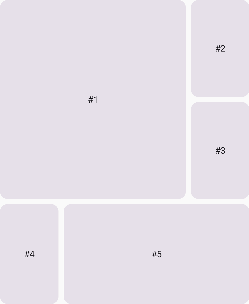 **Figure 1.** A flexible and adaptive two-dimensional layout with `Grid`.
## How is Grid different from similar composables?
Compose already offers similar components, such as [`LazyVerticalGrid`](https://developer.android.com/reference/kotlin/androidx/compose/foundation/lazy/grid/LazyVerticalGrid.composable#LazyVerticalGrid(androidx.compose.foundation.lazy.grid.GridCells,androidx.compose.ui.Modifier,androidx.compose.foundation.lazy.grid.LazyGridState,androidx.compose.foundation.layout.PaddingValues,kotlin.Boolean,androidx.compose.foundation.layout.Arrangement.Vertical,androidx.compose.foundation.layout.Arrangement.Horizontal,androidx.compose.foundation.gestures.FlingBehavior,kotlin.Boolean,androidx.compose.foundation.OverscrollEffect,kotlin.Function1)).
These components are mainly for visualization of large, homogeneous data sets---
for example, displaying a content catalog in a video streaming app.
These components are NOT designed
for the structural layout of a screen or complex component.
You can also implement a two-dimensional layout
by combining multiple `Row` and `Column` composables.
However, this approach has some downsides,
such as deep hierarchies and difficulties in adaptability.
The following table provides an overview
of which layouts are suitable for each API:
| Component | Purpose |
|---|---|
| `LazyVerticalGrid`, `LazyStaggeredGrid`, `LazyHorizontalGrid` | Visualization of large, homogeneous data sets that requires lazy loading. |
| `Row`, `Column`, `FlexBox` | One-dimensional layout |
| `Grid` | Two-dimensional layout |
> [!NOTE]
> **Note:** `Grid` doesn't support lazy loading.
## Terminology
Familiarize yourself with the following terminology
to understand how `Grid` works.
### Grid line
A grid is made up of lines, which run horizontally and vertically.
If your grid has three rows, it has four horizontal lines,
including the one after the last row.
In the following image, each dotted line represents a grid line:
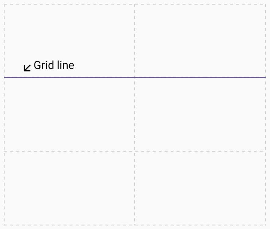 **Figure 2**. The grid consists of four horizontal lines and three vertical lines.
### Grid track
A grid track is the space between two grid lines.
A row track is between two horizontal lines,
and a column track is between two vertical lines.
To define the size of these tracks,
assign a size to them when you create the grid.
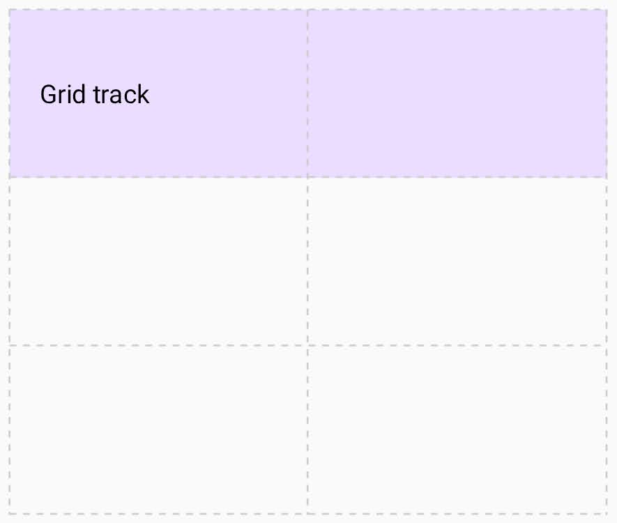 **Figure 3**. A grid track for the first row.
### Grid cell
A grid cell is the intersection of a row and column track.
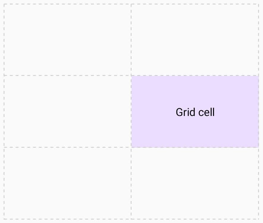 **Figure 4**. A grid cell that is an intersection of the second row and the second column.
### Grid area
A grid area consists of several grid cells.
You can define a grid area by making an item span multiple tracks.
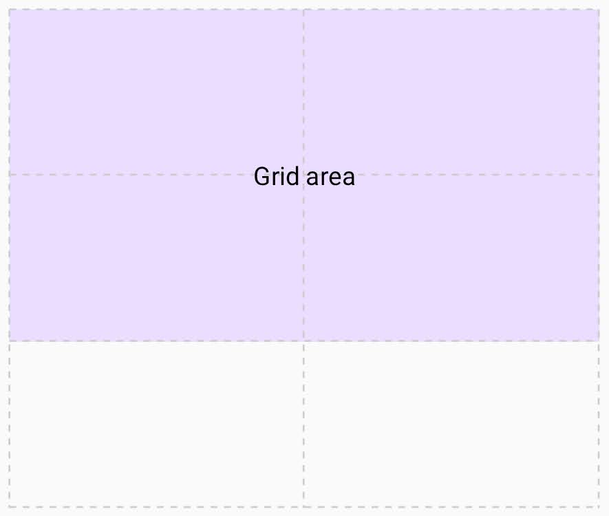 **Figure 5**. A grid area that consists of four grid cells.
### Grid gap
A grid gap is the gutter between grid tracks.
You can't place a UI element into a gap,
but you can span a UI element across it.
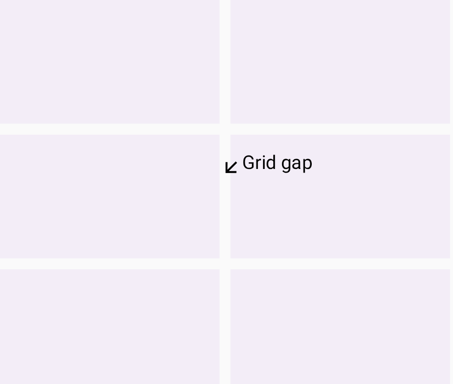 **Figure 6**. A grid gap between the first column and the second column.Related skills
| Skill | Stars | Updated | Works with | Status | Install |
|---|---|---|---|---|---|
| brainstormingobra/superpowersYou MUST use this before any creative work - creating features, building components, adding functionality, modifying behavior, or planning anything new, in software or out of it (a talk, a business, a renovation). | Stars: 322k | Updated | Claude CodeCodex | Verified | Install |
| brand-guidelinesanthropics/skillsApplies Anthropic's official brand colors and typography to any sort of artifact that may benefit from having Anthropic's look-and-feel. Use it when brand colors or style guidelines, visual formatting, or company design standards apply. | Stars: 198k | Updated | Claude CodeCodex | Verified | Install |
| frontend-designanthropics/skillsGuidance for distinctive, intentional visual design when building new UI or reshaping an existing one. Helps with aesthetic direction, typography, and making choices that don't read as templated defaults. | Stars: 198k | Updated | Claude CodeCodex | Verified | Install |
| mcp-builderanthropics/skillsGuide for creating high-quality MCP (Model Context Protocol) servers that enable LLMs to interact with external services through well-designed tools. Use when building MCP servers to integrate external APIs or services, whether in Python (FastMCP) or Node/TypeScript (MCP SDK). | Stars: 198k | Updated | Claude CodeCodex | Verified | Install |